SIWI’s new look – it’s not just about the logo

For SIWI, this process has involved going back to the basics for an in-depth analysis of the organization’s fundamental characteristics and needs, together with the benefits and shortcomings of the existing – now previous – appearance.
– We put a lot of effort into this initial part, bringing in everyone in the organization. I am a firm believer in understanding not only what must change, but also what must be kept – what I like to call the organization’s DNA. And to understand this, we had to engage the entire staff.
Welin says that it was an early decision to make use of archetypes in the design process, as a method to describe what the new visual identity should aim for. The concept of psychological archetypes was developed by Swiss psychologist Carl Jung in the early 1920s but is heavily inspired by thoughts from the Greek philosopher Plato, some 2,400 years ago.
“I am a firm believer in understanding not only what must change, but also what must be kept – what I like to call the organization’s DNA.”
In the branding process, archetypes can serve as a tool to identify an organization’s behaviours, needs and motivations. One of the main benefits is that they represent the full spectrum of characteristics, opening for a more authentic and holistic approach to branding, compared to some alternatives.
– When you have done your research and put together your strategy, you often have a very text-heavy material, and it can be difficult to translate that into something tangible and visible. Archetypes is a good tool to bridge the gap. They help us make the strategy more human.
The following design process was derived from the archetypes and the keywords associated with them. Welin says that the archetypes primarily serve as a backdrop for the work, providing inspiration rather than answers. They are the imaginary friends of the designer to help chose colours and find graphic solutions. Which leads us to the inevitable question: is it imperative that a water organization use a lot of blue in its visual identity?
– I honestly think so, everything else would look out of place. But colour psychology is a vast subject, and it is not just as simple as that. How colours and colour combinations make us feel and what we associate them with is a complex science that is also an important part of creating an effective visual identity.
According to Welin, the potential of visual identity should not be underestimated. But while the water community increasingly recognize the importance of good communication, understanding and realising this potential is no matter of course.
– There is always a certain element of insecurity when you change something. You know what you have but not what you will get, and change can be a scary thing. That is another reason why I think it is wise to involve as many people as possible in the early stages of a change process. And to make sure that whoever leads the work is not just an expert in visual identity, but also someone who knows the organization very well. Done right, the visual identity can be a great way to achieve a lot with relatively small means.
Emy Welin’s tips for working on your brand’s visual identity
-
Be clear about the reasons.
Do not undertake a rebranding or changing of the visual identity for the sake of it. Before anything else, identify the reasons for the change and set clear goals for what the new identity should achieve. This will be something to steer towards during the entire process.
-
Start with what you have.
There is no need to reinvent the wheel. You will most likely have elements of your existing visual identity that works well. Identify what they are and how they can be incorporated in the change process.
-
Involve the organization.
Make sure that everyone feels involved and get to provide input right at the beginning of the process. This creates a shared sense of engagement and care, and it ensures that the organization’s DNA is reflected in the end result.
-
Build on inside knowledge.
Make sure that the people driving the process knows the organization and its needs. Only by combining design and branding expertise with in-depth knowledge about the organization can the right results be achieved.
The thinking behind SIWI’s visual identity
SIWI’s new visual identity is based on a set of keywords, derived from two main archetypes, and translated into visual elements, such as collaboration being represented by a variation of linked shapes, and change by a shifting colour scale. Blue is the obvious colour choice to illustrate water, but it is also a colour associated with knowledge.
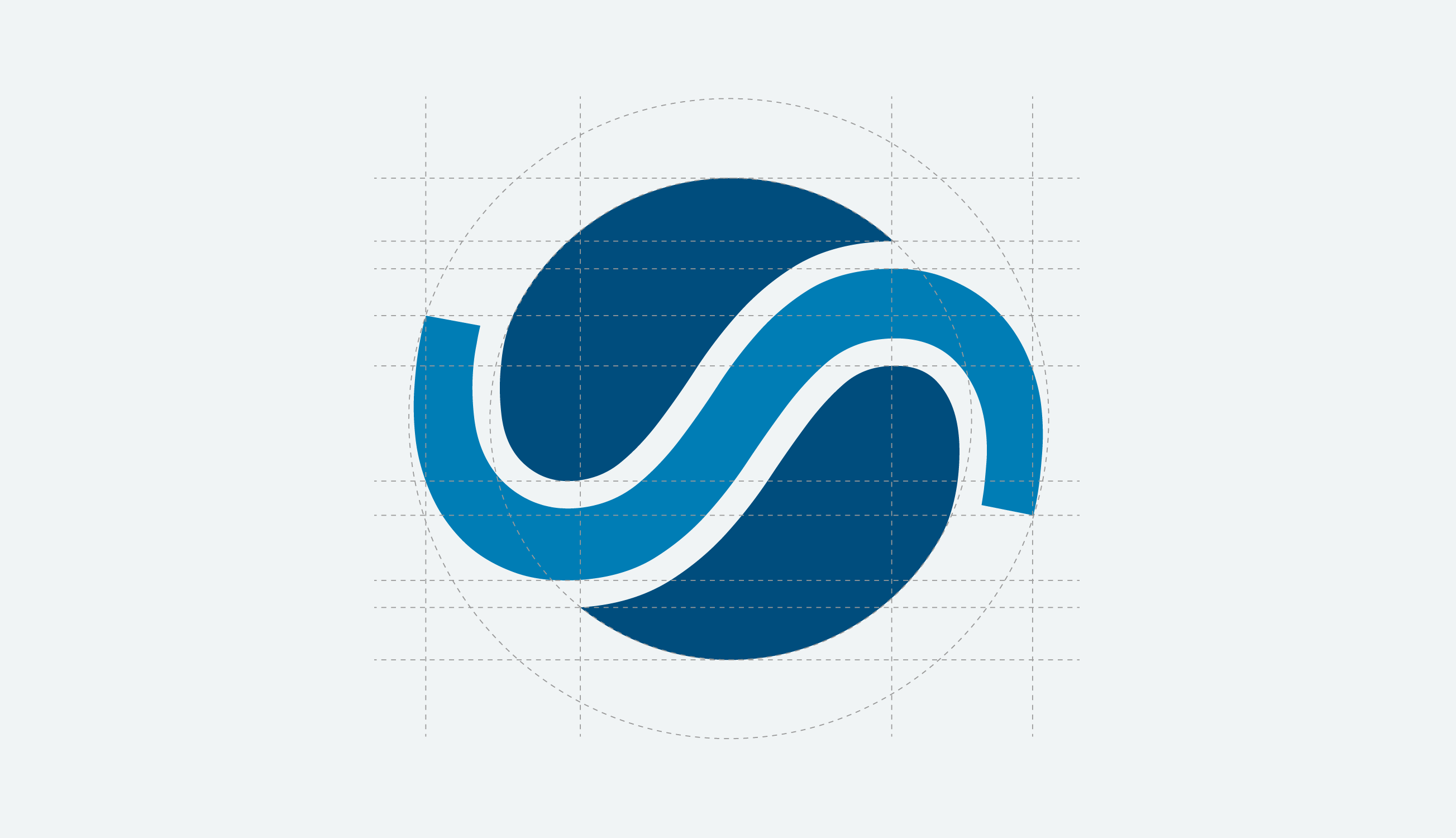
SIWI’s heritage and history are carried forward in the shape of the S, repurposed as a wave and a forward motion in the new logo. It is combined with a blue globe, a symbol of inclusiveness and a representation of the blue planet we live on and the global work we do for a water wise world. Looked at differently, the globe can also be interpreted as two precious droplets of water. The same S, or wave, return in backgrounds and patterns, where they form rivers winding their way across the screen or paper, reminding us to respect and protect the entire water continuum, from the source to the sea.


